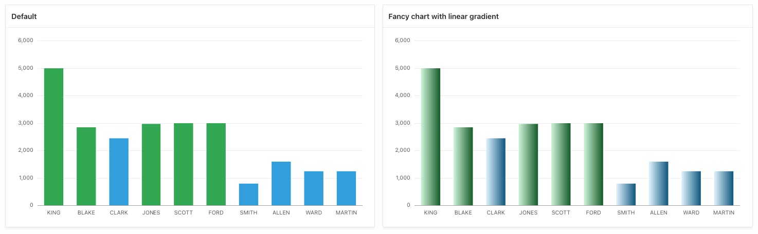
The default look of Oracle APEX charts isn’t very exciting, but thankfully, there are a few ways to change it. Aside from normal customization, you can, for example, add a linear gradient effect.
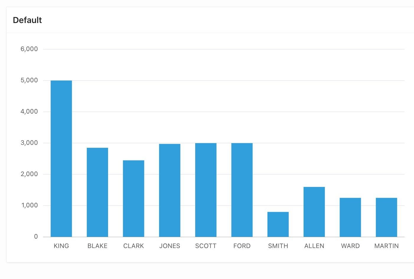 Adding
color gradients to these bar charts would be nice. For example, we can
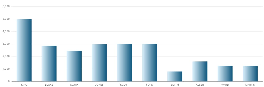
make them look like in the screenshot below. Nice, isn’t it?
Adding
color gradients to these bar charts would be nice. For example, we can
make them look like in the screenshot below. Nice, isn’t it?
We can customize charts with many options using ojcharts (learn more by watching this video on using Oracle Jet tables and charts in APEX. I’ll show you how to do it using JavaScript, CSS, and HTML.
Adding a linear gradient to an APEX chart
First, you need to add a static id “fancy” to the “Fancy” chart region:

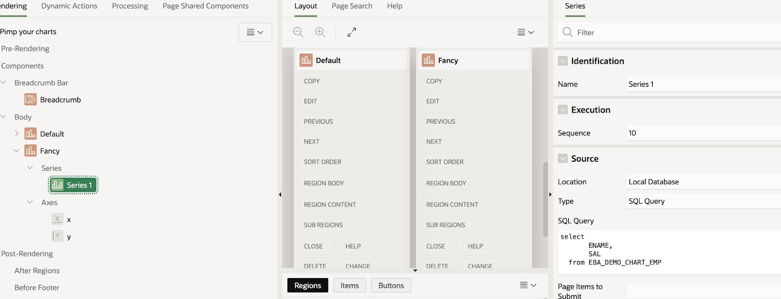
In my case, “Series 1” query looks like in the screenshot below:
Now, you need to add two dynamic actions to your chart: Blue and Green. Choose “After Refresh” under Event and “Region” as Selection Type, as seen on the following screenshot:
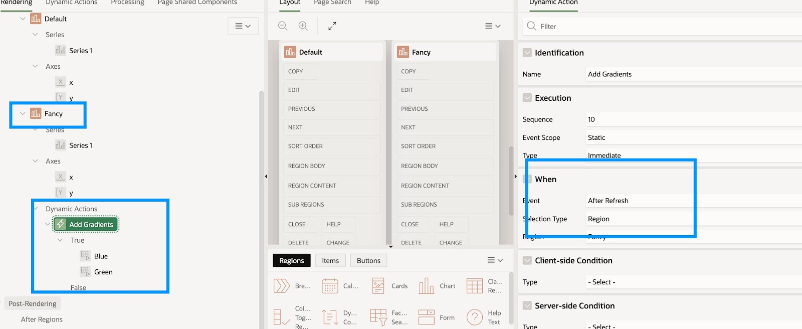
Below, you can find the JavaScript code you:l need to paste in and execute.
Blue
Green
After saving the files, you’ll notice there are now two linearGradient elements added to your Chart with id “Fancy” ( “_jet” will be added automatically).
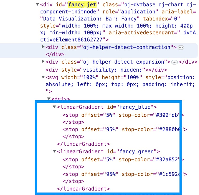
We will use these two elements during the next steps. First, add the following Inline CSS to your page:
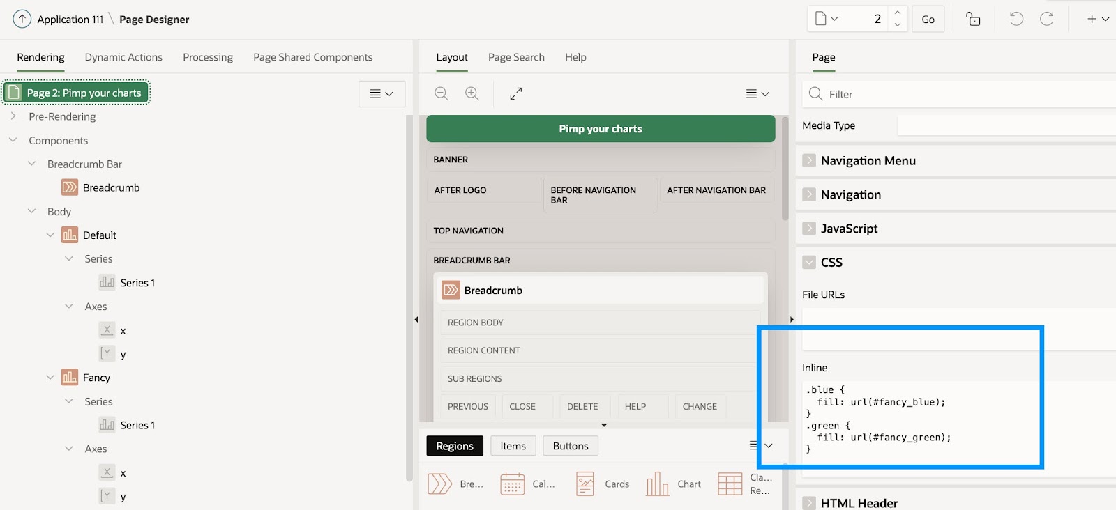
Classes “blue” and “green” point directly to linear gradients created with dynamic actions. Now, go to your “Series 1” Attributes -> Advanced -> Initialization JavaScript Function.
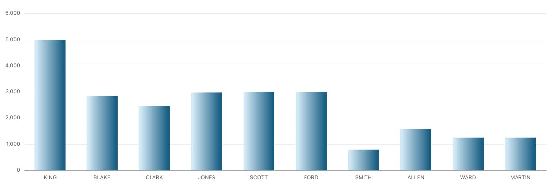
This function will add CSS class “blue” to every series in the “Fancy” report. This CSS class will point to the “fancy_blue” gradient. This is how it looks now:
Conditional chart colors with gradients
But that’s not all. Wonder why I previously created an additional gradient called “fancy_green”, when the example above only used the blue one? That’s because I want to add a nice green color gradient to those series on charts where employees’ salary is higher than 2500. How to do this?
First, change your SQL query to decide when to use green/blue color. It will create a column called “colours”:
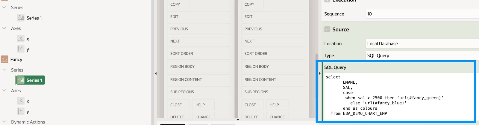
Now, got to Use Appearance -> Color to substitute chart color with the value from your query (column COLOURS).
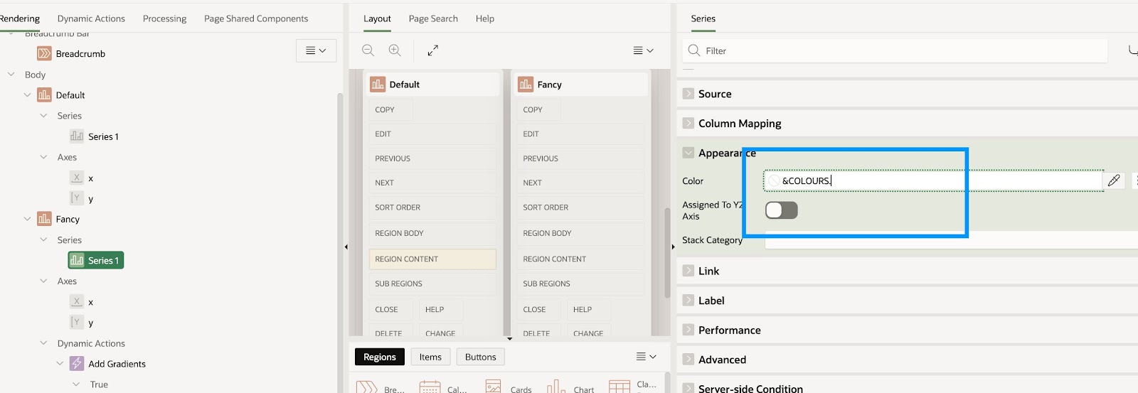
Don’t forget to remove code from “Series 1” Attributes -> Advanced -> Initialization JavaScript Function – it’s not needed now (neither is CSS from the page -> Inline -> CSS).
Summary: more options are always better
The final result of our work looks like on the screenshots below. You can see both versions – with and without linear gradient, using the exact same colors. Getting there took some effort for sure, but I believe it was worth it. And even if you prefer simpler looks, having more options is always nice, isn’t it?